King Caesar Photography Mock-ups
Designed for Personal
Project Website Redesign
Created June 2014
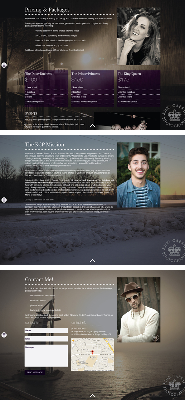
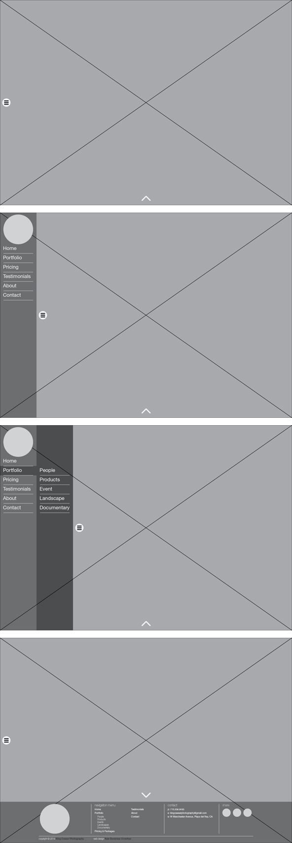
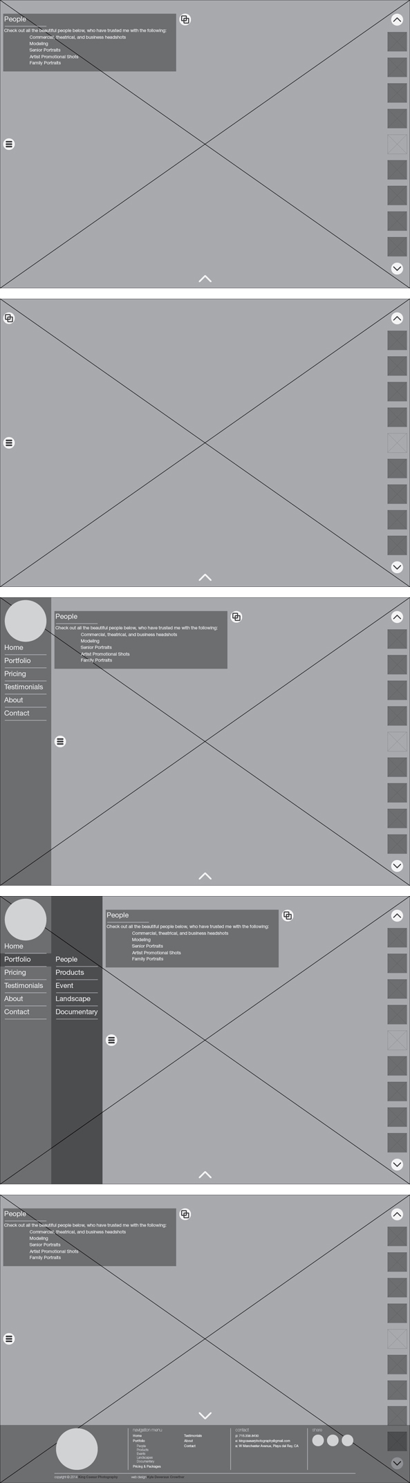
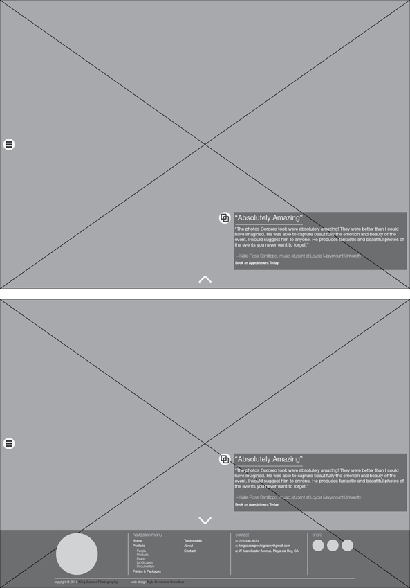
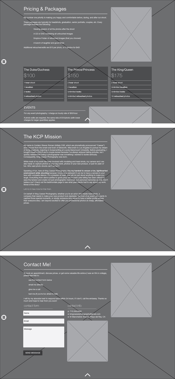
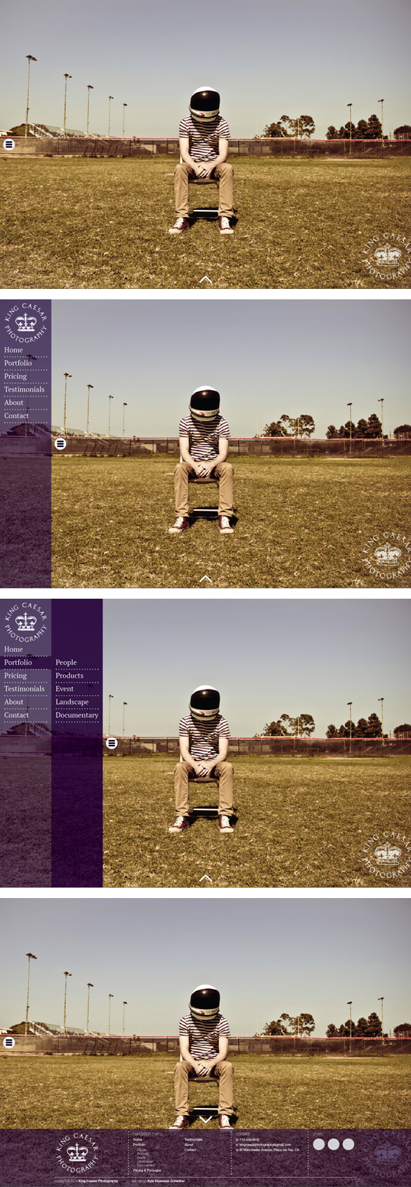
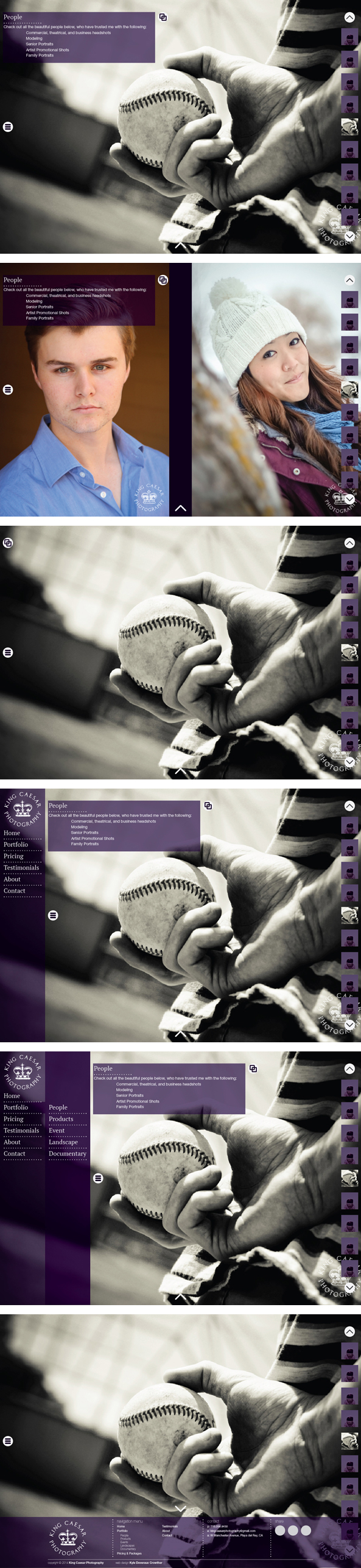
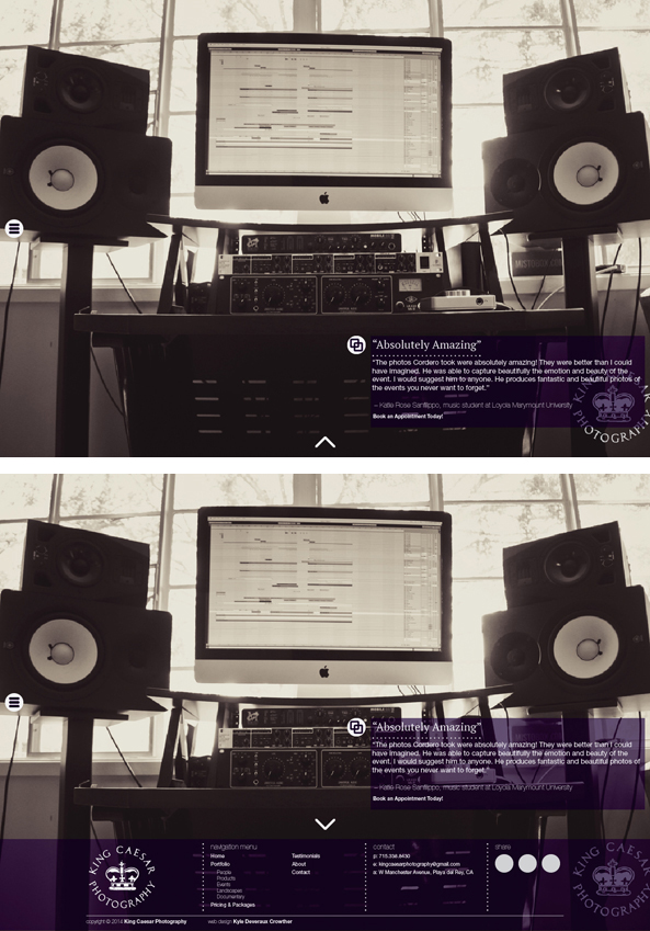
As a personal exercise, I decided to redesign a friend’s photography website. He began to take his photography more seriously, but I felt that his website was lacking. I set out to achieve two things: 1) Prevent obstruction of his photography, and 2) Make it look more professional. To make his photography the number one priority, I chose a design with full window photos as background and portfolio images (two images if portraits). Also, I wanted anything that wasn’t a photo (menu, footer, etc.) to have the ability to be hidden. Everything else fell into place on a 12-column grid. The first set (black and white) are the wireframes. Rectangles with “x” denotes a photography. The second set are high-definition wireframes, with pictures, font changes, color, and other aesthetics. His original site can be viewed (here).
Wireframes (Black and White)
Home Page
Portfolio Page
Testimonial Page
Pricing, About, and Contact Pages
High-Definition Wireframes (Visuals)
Home Page
Portfolio Page
Testimonial Page
Pricing, About, and Contact Pages